
3 Book Covers. 1 Dark Matter Story.
From Substack to print. Help choose the face of the story.

📖 See all chapters and bonus content in the Story Index.
Dark Matter began here on Substack, as a story unfolding one chapter at a time. A shared journey between writer and readers.
Now it’s preparing for its next step: a print edition, for those who still believe that stories deserve to be held, not just scrolled.
Marta Dec, the illustrator of the print edition, has sent me three possible covers for the book. Each captures the same idea: humanity reflected through its own creations, but with a different tone and light.
I’d love your help choosing which one should represent Dark Matter in its printed form.
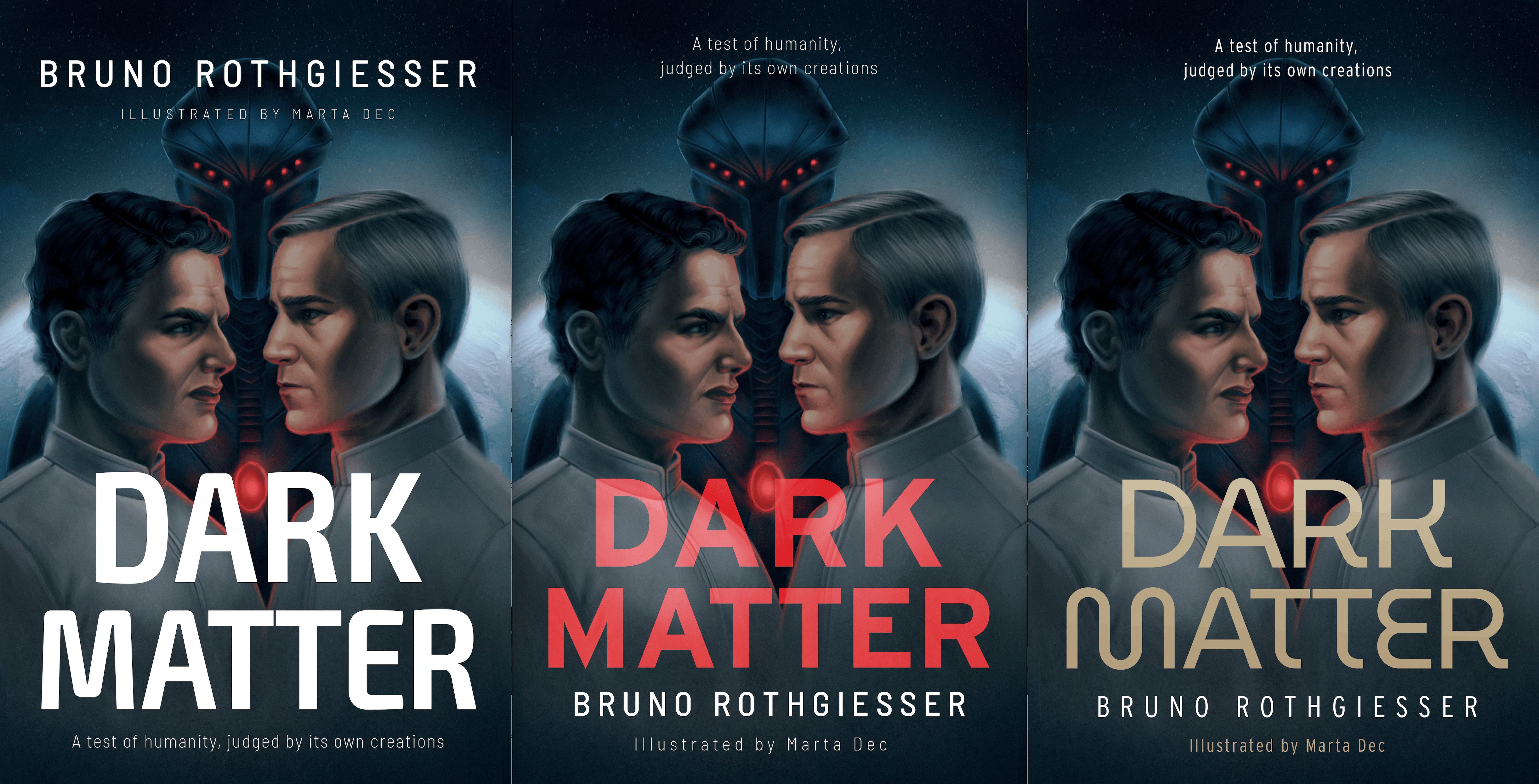
Thank you for being part of this story and for helping shape what it will become next. If you have further thoughts or preferences about the design, I’d love to read them in the comments below.
The middle one has the most emotive feel to it, but I voted as a UX designer 🤓 for the cover that was the clearest. It's the most legible at the smallest size. They're all good though.
Majeris makes a good point too about how it looks on a Kindle screen. Something I'll have to write down for when I'm finally deciding on a cover too 😇
The center one is the most eye-catching... in color. Yet, I strongly recommend loading all three into a Kindle to see how it looks like on monochrome e-paper. Stuff tends to look differently there.
And while on the subject, e-readers, e.g. Kindle display all kinds of iconery in the corners of the cover, like "New", read progress, etc. Something to take into account when designing title/author name placement.